Microsoft working on introducing Fluent design to the Settings app and UI refinements
At Build 2017, Microsoft introduced a new design language for Windows called Acrylic or Fluent design. With Fluent design, Microsoft aims to move Windows UI to a new level. You can read more about it here.
Redstone 3 started integrating this design in shell elements like Start menu and action centre. Apps specifically the ones made by Microsoft also started to revamp with this starting with Redstone 3. Microsoft says RS3 is the base for fluent design and would be introduced slowly to other elements with later releases.
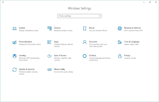
Microsoft continued its commitment with Fluent after shipping Redstone 3. Starting with Redstone 4, Microsoft introduced Fluent Design to its ambitious app Mail and Calendar. Now screenshots released by Rafael Rivera, a known Windows enthusiast show some exciting changes in regards to this with Settings app is the next thing to get the taste of Fluent design together with a revamped UI that looks far more good than the current one.
 |
| The Personalization Settings with new Fluent design |
 |
| New revamped UI |
Pretty nice. Isn’t it? And this much-expected change as Settings is a very important part of Windows that should have got the new UI ages ago in my opinion.
